
FRAME BY FRAME · ISSUE 3
Coraline Visual Analysis
2009 · Fantasy / Animation / Family · Directed by Henry Selick
Spoilers below, including the ending.
Henry Selick’s 2009 Coraline is unusually easy to recognize from a partial image. You do not need the title character’s face or the story’s most famous threat. A small figure against an oversized moon, a blue tunnel, or a house that looks inviting and slightly wrong can be enough. The film builds a visual world in which color, scale, and texture keep telling you where you are—and whether that place deserves trust.
For MovieWordle players, that is a better guide than a list of plot events. The approved frames use the movie’s strongest recognition materials: a moonlit silhouette, the passage between worlds, and a web that turns a child-sized space into a trap. They are clues to a larger design, not six scenes that need six separate interpretations.

How to recognize Coraline from color, silhouette, and scale
Coraline makes its protagonist legible as a small, active shape inside spaces that are too large, too elaborate, or too carefully staged for her. The moonlit house frame works because the figure and building have a clean outline. Even without dialogue, the image suggests a child facing an environment with its own imposing personality.
The film’s palette sharpens that effect. Cool blue and purple passages can feel exploratory, but they also make depth difficult to judge. Brighter, more ornamental images can look welcoming while carrying an uneasy excess. The point is not that one color always means safety and another always means danger. It is that color helps the film make each world feel like it has different rules.
That makes a good post-game habit: look for a child-sized silhouette, an exaggerated house or garden, and a palette that seems designed rather than merely natural. Together, those elements are more reliable than trying to identify one isolated prop.
The tunnel is a boundary, not a shortcut
The blue tunnel frames are among the clearest visual signatures in the game set. They do not just show travel from one place to another. Their rounded walls make the passage feel tactile and enclosing, as if Coraline has entered a space with no ordinary horizon.
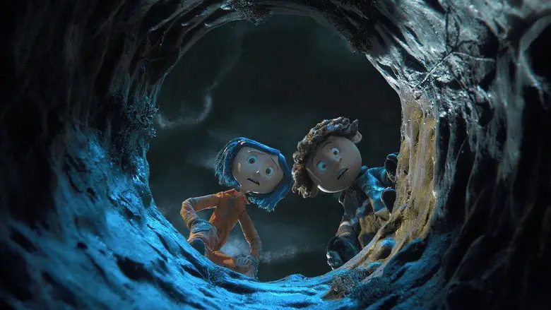
That distinction matters because the story’s tension depends on thresholds. The Other World first appears as an answer to boredom and neglect: it is brighter, fuller, and more attentive. But the route there is narrow and controlled. The tunnel’s shape quietly anticipates the trade-off. A passage that feels magical can also feel like a channel that only permits one direction at a time.
This is visual storytelling with a useful level of restraint. The frame does not need to announce what will happen next. It gives the viewer a physical sensation—curiosity mixed with confinement—and lets the story earn the rest.
Texture and size make the fantasy feel close enough to touch
The film’s world has a handmade-looking density. Surfaces appear soft, ridged, stitched, or deliberately uneven; flowers, furniture, fabric, and tunnels seem to have weight. That tactile quality is one reason the fantasy can feel more intimate than a smooth, distant spectacle.
It also makes changes in scale more unsettling. When Coraline is caught in the web in one approved frame, the composition does not only say “danger.” It makes the environment seem to have become larger and more possessive. The web fills the space around a small body, turning a decorative detail into a structure that controls movement.
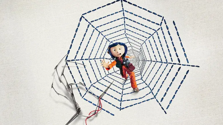
For a player, the useful recognition cue is the collision of playfulness and constraint. Coraline can offer a bright tunnel, oversized flowers, or a fanciful house, then let the same world become restrictive a moment later. The visuals remember both feelings at once.
Coraline ending explained, briefly
The ending confirms that Coraline has escaped the Other World, but it does not treat escape as a reason to forget it. She and Wybie remove the danger of the small door rather than leaving a convenient route back. The final mood is relief with a trace of caution: Coraline is home, yet the film has taught us that an appealing alternative can demand too much in return.
That is why the ending is satisfying without becoming careless. Coraline has not simply learned to prefer a duller version of the same life. She has learned to see attention, choice, and belonging more clearly. The bright surfaces of the Other World were not meaningless; they were persuasive. The conclusion works because it lets her reject the trap without denying why it appealed to her.
What the MovieWordle frames preserve
The selected images keep the spoiler burden light while carrying the film’s identity. The moon-and-house silhouette gives you scale. The tunnel gives you the boundary between worlds. The web gives you the moment when a decorative fantasy becomes a cage.
Taken together, they suggest why Coraline stays with viewers. Its imagery is specific enough to be guessed from a fragment, yet the fragments are always doing story work. A color, a texture, or a small figure against an oversized design can hold both invitation and warning.
Conclusion
Coraline is memorable because its visual world makes wonder and unease inseparable. Its color, silhouette, tunnels, and tactile spaces tell a player where they are before the plot says it aloud. That is why the approved MovieWordle frames are strong clues: they preserve the film’s visual pull while leaving its discoveries intact.
Keep playing
Ready for another film? Browse the MovieWordle 6 Frames archive and choose a recent puzzle to solve.